

Ag Weather Forum
Look Closely at US Drought Monitor for Real Story
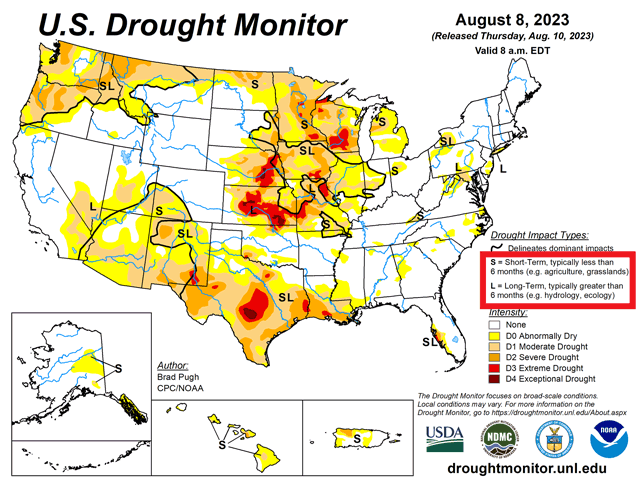
Readers of the U.S. Drought Monitor have had a skeptical eye recently as heavy rainfall has improved crop conditions across a lot of the Corn Belt. But they may be missing a key piece of information on the map.
Heavy rain fell across Nebraska and parts of Kansas and Missouri the week leading up to Aug. 8, the cutoff date for the latest map that was released on Aug. 10. Many areas were in the 2-to-4-inch category. Some areas of Missouri saw over 8 inches of relieving rainfall. We did see some changes to the map, but not to the degree that many were expecting, leading to some confusion.
DTN/Progressive Farmer Associate Content Manager Elaine Shein visited Kevin Harsch at his farm near Wood River, Nebraska Aug. 8 as part of the DTN Digital Yield Tour. Harsch noted that he was optimistic about drought being reduced in his area due to recent rainfall. "We're probably going to be out of it now, after the rains from last week (over 3 inches)," he said. But when the U.S. Drought Monitor map was released on Aug. 10, the map showed no such improvement. His farm remains in the D3 category (extreme drought) on the map.
Zachary Grossman, who farms in north-central Missouri reported that he received 10 to 12 inches of rainfall during the last couple of weeks in his interview with DTN Crops Technology Editor Pam Smith as part of DTN's "View from the Cab" series. The Drought Monitor map improved drought by just one category in his area, which is still in D1 and D2 (moderate to severe drought). You can find more about Grossman's weather journey this season here: https://www.dtnpf.com/….
Both farmers' recent precipitation would suggest a far more reduced drought area and intensity on that map. And rainfall around much of the southwestern Corn Belt has been significantly better during the last month, but there's still a lot of color across the bulk of the Corn Belt.
P[L1] D[0x0] M[300x250] OOP[F] ADUNIT[] T[]
However, there is one detail that people may be missing when looking just at the colors, and that is the "S" and "L" labels. "S" refers to drought effects that are short-term and generally less than six months, typical for those impacts to agriculture. "L" therefore refers to drought effects that are more long-term and generally longer than six months. There could still be an impact on agriculture, but this generally is a more ecological and hydrological drought.
According to Brian Fuchs, Geoscientist and Climatologist with the National Drought Mitigation Center, and one of the editors of the U.S. Drought Monitor, that is an important distinction. "For producers, they really are concentrating and concerned about the most recent time scales. That is human nature for them and I completely understand why, too," Fuchs said in an email to DTN.
Fuchs mentioned that recent precipitation is only one driver of the colors you see on the Drought Monitor map. "Many other indicators go into the assessment as well: soil moisture, groundwater, surface water, ecological impacts, etc."
Even long-range precipitation deficits are a part of the monitor's classification. The 12- and 24-month deficits can have a major impact on the long-term drought, "L", that you see on the map. When asked about the Wood River, Nebraska area specifically, Fuchs stated, "I looked at the data a bit and for the last 12 months, this area is still 9-12 inches below normal precipitation which is solid D2/D3 on that one indicator alone. The 24-month indicators are similar, in the solid D3 area with deficits of 12-16 inches below normal."
The effects from the last two years of La Nina conditions remain a scar on portions of the Central Plains. Much of the drought that remains across Nebraska, Kansas, and Missouri is in this long-term classification. There are still large areas of the Corn Belt with short-term drought effects though, too. Recent precipitation has gone a long way to combat the drought. But changes to drought, which is a longer-term phenomenon, tend to be gradual.
Fuchs also made sure to mention that changes to the Drought Monitor are typically slow. "Some of the historical rains the Midwest has recorded lately do call for multiple category changes, but we try to limit the changes to one category if we can."
Despite the slower-changing colors and conditions that the map, Fuchs maintains that the U.S. Drought Monitor map is the "gold standard" for monitoring drought around the world.
"No other process takes into account so much data, is peer-reviewed as it is made, and accounts for so many variables. This is exactly why it was developed as prior to it, single indicators/indices were used and by themselves and they all have warts. The U.S. Drought Monitor process allows for all of those same indicators/indices to be used, but we can take the best attributes of each and work through the warts, combining it into a comprehensive product," he said.
Users of the U.S. Drought Monitor should also be aware that the map is not just specific to agriculture. There are all sorts of ways you can classify drought. The U.S. Drought Monitor does its best to take all of those different ways and to put them on one map. Therefore, it may take a keen eye to depict what it means for your specific application.
Learn more about how the U.S. Drought Monitor map is drawn here: https://drought.unl.edu/….
To find more weather conditions and your local forecast from DTN, head over to https://www.dtnpf.com/…
John Baranick can be reached at john.baranick@dtn.com
(c) Copyright 2023 DTN, LLC. All rights reserved.

Comments
To comment, please Log In or Join our Community .