

Canada Markets
Producer Deliveries as of Week 22
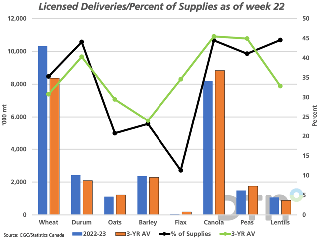
The blue bars on the attached chart show the volume of grain delivered by producers into the licensed handling system over the first 22 weeks of the crop year, or as of Jan. 1. These bars are compared to the three-year average, as shown by the brown bars.
Of the select crops shown, deliveries of wheat, durum and lentils are higher than year-ago levels for this period (not shown) as well as the three-year average. The volume of wheat delivered is 23.6% higher than average, the volume of lentils is 21.3% higher than average and the volume of durum is 16.3% higher than average. For comparison, cumulative deliveries for all principal field crops as of week 22 are shown at 28.3163 million metric tons (mmt), which is 1.5839 mmt or 5.9% higher than the three-year average.
P[L1] D[0x0] M[300x250] OOP[F] ADUNIT[] T[]
Of the crops shown, deliveries of flax as of week 22 are down 53.6% from last year and 67.1% below the three-year average at 57,800 metric tons.
Despite the big rebound in canola production from the drought reduced crop of 2021, canola deliveries are only 5.2% higher than one year ago while 7.3% lower than the three-year average. This bears watching; signaling that producers may be reluctant sellers or the possibility that the crop may not be quite as large as forecast.
The black line shows the volume delivered as a percentage of the total supplies available for delivery, defined as Statistics Canada's July 31 farm stocks estimate added to the forecast production for 2022. These lines are plotted against the percentage scale on the secondary vertical axis. The green line represents the three-year average, which indicates that producers have delivered a higher percentage of available supplies on average for five of the eight crops shown on the chart.
Looking at the largest crops, producers have delivered a larger share of wheat (35.3%) and durum (44.1%) than seen with the three-year average, while have delivered 44.5% of the canola available for delivery, which is just 1 percentage point lower than the three-year average.
Cliff Jamieson can be reached at cliff.jamieson@dtn.com
Follow him on Twitter @Cliff Jamieson
(c) Copyright 2023 DTN, LLC. All rights reserved.

Comments
To comment, please Log In or Join our Community .