
Kub's Den
The Where and When of Drought During 2022's Growing Season
The list of places experiencing drought during this second year of "Triple-Dip" La Nina is disturbingly long. Portions of Europe, portions of China, and closer to home, effectively the entire state of California, where hundreds of thousands of cropland acres are being left fallow amid water restrictions.
But when we observe those persistent hotspots of exceptional drought in California's Central Valley vegetable-growing region, or in Nevada or even Texas, how should we interpret it, from a commodity market perspective? It may sound callous to say it out loud, but the trading computers in Chicago don't care that it rained in Arthur, Nebraska, over the weekend. (Sorry to pick on a random, small, Sandhills town). Two inches of rain in Ottumwa, Iowa, however? Not much help anymore, but if it had arrived two months ago, we'd have had something to talk about.
Therefore, broad quantitative factoids like "70.09 percent of the contiguous United States was categorized as either Abnormally Dry or in some degree of Moderate to Exceptional Drought on July 5, 2022" don't really tell us much about how crops and animals fared through the growing season. If a tree falls in a forest, and no one is around to hear it, does it make a sound? If drought worsens in a relatively barren place, and no one but a few horned lizards are around to experience it, does it influence the markets?
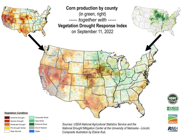
Helpfully, the National Drought Mitigation Center at the University of Nebraska-Lincoln publishes a map series called VegDRI (https://vegdri.unl.edu/…) showing the effects of drought on vegetation specifically, color coding their Vegetation Drought Response Index. VegDRI uses observations from satellite data and other biophysical information like soil available-water-capacity, land use type, and elevation to measure each square kilometer's relative condition compared to how much "seasonal greenness" could historically be expected (with 1989-2008 as a baseline). Across the United States, this map shows drought's effects on all growing things: not just corn plants, but also pastures and hayfields and trees and chaparral. In even more specificity, they publish a crops-only version (https://vegdri.unl.edu/…) that removes the distraction of droughty chaparral in the West.
P[L1] D[0x0] M[300x250] OOP[F] ADUNIT[] T[]
But even this 'Crops' layer alone can't isolate the specific effects on a particular commodity market. "Unusually moist" conditions in crop fields in northwestern Minnesota may have been bearish to spring wheat futures traded at the Minneapolis Grain Exchange but have only negligible significance for the soybean futures market.
For the U.S. corn market, specifically, I've overlaid the VegDRI drought illustration with a USDA map showing the concentration of corn production county by county. This visually highlights some spots where late-season drought has overlapped with areas of particular interest to the corn market. Specifically: Iowa. Even more specifically, Iowa's southeastern and northwestern corners, where USDA's map shows individual counties typically produce over 30 million bushels of corn in a given year, and where the VegDRI map shows real conditions on the ground have intensified into moderate-to-severe drought from July through September.
Another interesting blob on the map is the heavy corn-producing counties in irrigated southwestern Nebraska and northeastern Colorado. Without the corn production layer to consider, it's tempting to write off the widespread redness on the Nebraska drought map as mostly a pasture problem, or as something that irrigation can mitigate without major impacts on the nationwide corn market. But noticing just how heavily invested this region is in growing corn reminds us how much the livestock feed market is depending on whatever grain they manage to harvest.
Other surprises pop out from the maps. In the not-so-fringe area of North Dakota's Red River Valley, you'll find more corn plants per square mile than in Ohio, for instance, or even Indiana. So, although parts of Indiana are dry according to the Vegetation Drought Response Index, and although it's technically an "I" state, should we let that potential scarcity outweigh the potential abundance from the more-moist north?
Overall, the two maps together help emphasize how this summer's drought pattern has almost perfectly, disastrously, overlapped the heart of the country's Corn Belt. It's a mental reference to keep in mind as harvest reports start rolling in, first from regions like Kansas and Missouri, where corn production isn't so heavily concentrated, but soon, from the very heart of the Corn Belt where this year, a market and a drought have managed to overlap in an alarming way.
**
Comments above are for educational purposes only and are not meant as specific trade recommendations. The buying and selling of grain or grain futures or options involve substantial risk and are not suitable for everyone.
Elaine Kub, CFA is the author of "Mastering the Grain Markets: How Profits Are Really Made" and can be reached at masteringthegrainmarkets@gmail.com or on Twitter @elainekub.
(c) Copyright 2022 DTN, LLC. All rights reserved.